Project
Lumina: a walking app that scores each block for safety
Map apps pick the fastest way to walk somewhere, even at night. I built Lumina, an iPhone and web app that compares walking routes by how safe each stretch looks, using public crime records, street lighting, nearby businesses and transit stops. Building it showed me that the crime records measure something other than what I assumed.
- Role
- Sole Developer
- When
- Apr 2026 to present
- Live
- lumina.myrondomain.com
The problem
If you are walking home after dark, the shortest route can take you down an unlit side street when a busier one a block over would add a minute. Map apps don't tell you the difference. I wanted an app that would show two or three ways to get somewhere and say which one stays on better-lit, busier, lower-crime blocks.
Who it's for
People who walk alone at night in Los Angeles, San Diego or San Francisco: students heading home from a late class, someone leaving a shift, anyone walking from a train stop. It also lets a friend follow along live.
What I built
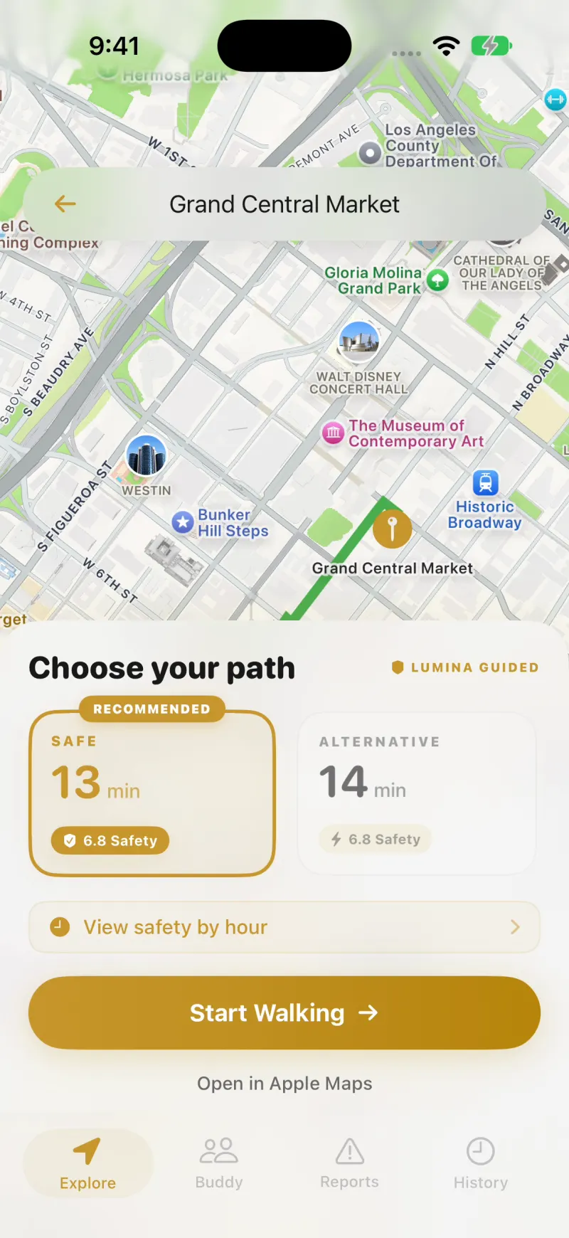
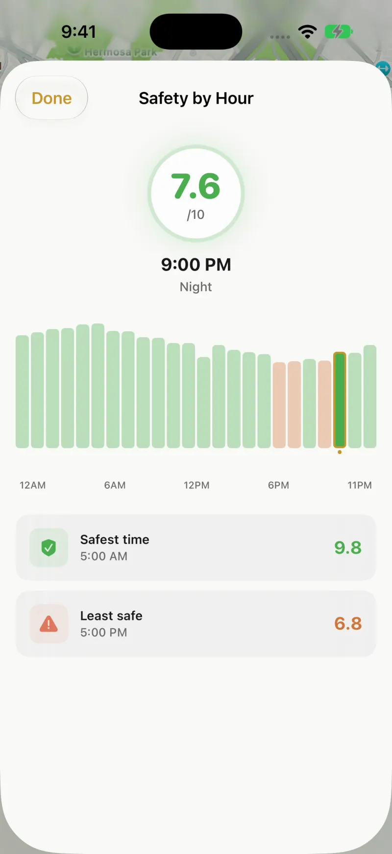
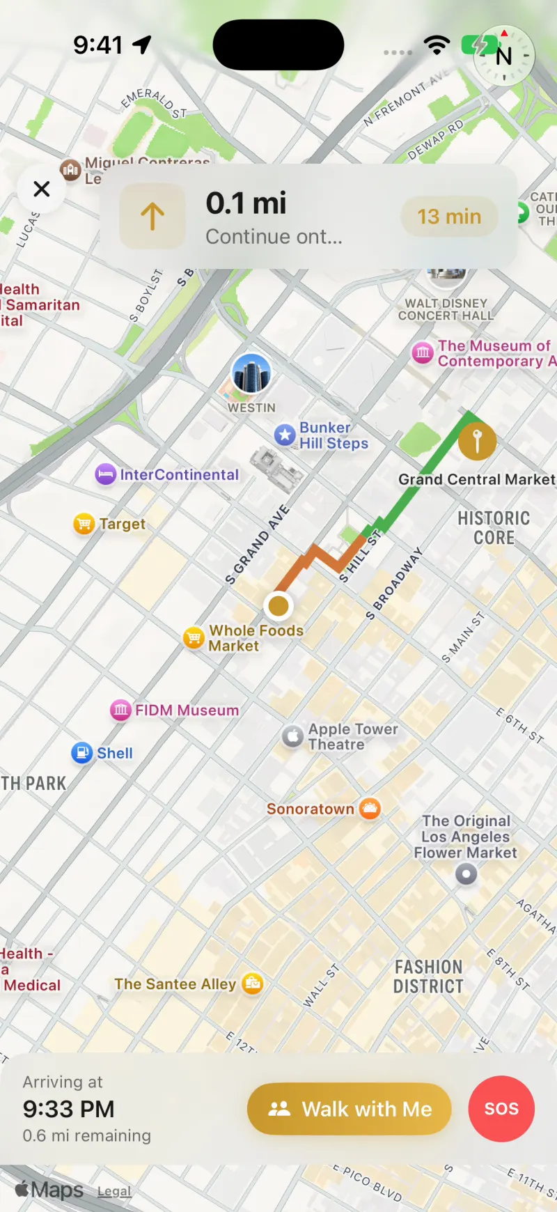
On the iPhone you type a destination and Lumina offers routes side by side, each with a safety score out of 10 and a walking time. A safety-by-hour chart shows how a spot's score changes over the 24 hours of a day. Once you start walking, it gives turn-by-turn directions, a "Walk with Me" button that shares your live location with a friend, and an SOS button.
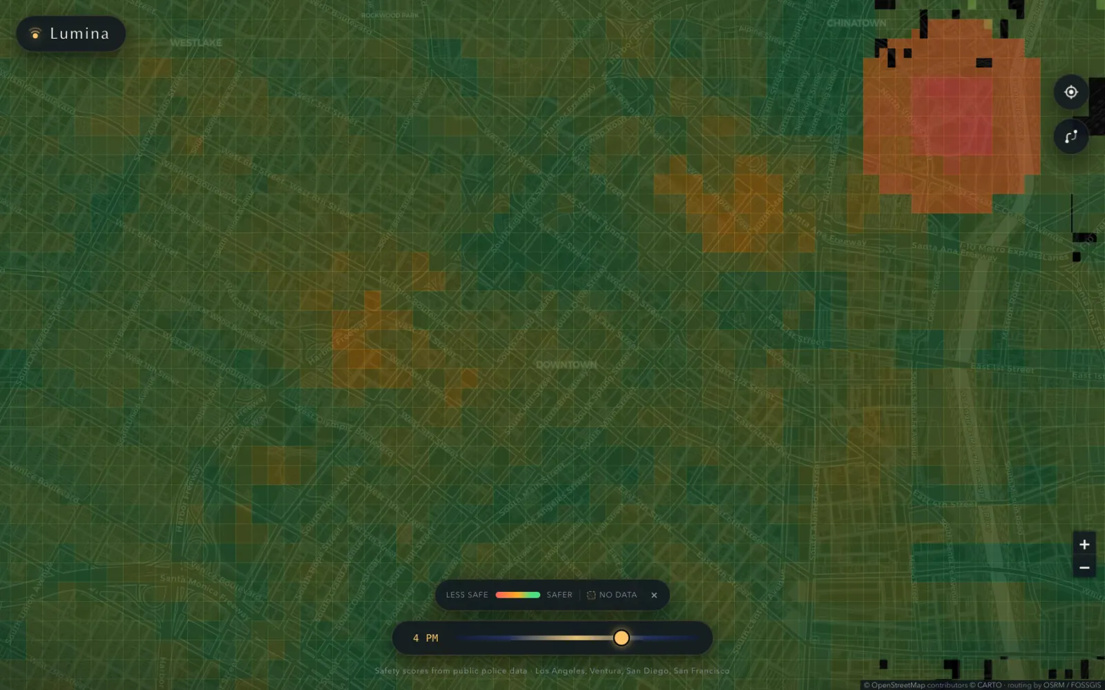
There is also a web version that shows the whole city as a heat map, with a slider for the hour of the day.
What I found
Four of the model's seven inputs come from crime records. I found that blocks with heavier police presence generate more reports regardless of how much actually happens on them.
Those records are police reports, and reports get written where police already are, so more police on a block means more reports whether or not more happens there. I built an app that told people to avoid the blocks the city was watching hardest.
I documented the bias in the project alongside its other limits. The app's notes say the scores come from public incident data that carries reporting bias, that each score ranks a block against the rest of its own city and is not a measured chance of something happening to you, and that the app is a prototype and not a safety guarantee. Stretches with too little data show up gray as "no data" instead of getting a middle score. I have not corrected the model for police presence; the scores still carry the bias, and the documentation says so.
Lumina is not on the App Store and has no users I can count. I tested the iPhone app in the simulator (18 regression checks passing) but have not tested it on a physical phone or measured battery use.
Under the hood
Data
Python scripts pull crime incidents from the Los Angeles Police Department (LAPD), the LA County Sheriff, Santa Monica, Beverly Hills and Long Beach open-data portals, SANDAG (the San Diego Association of Governments), San Francisco's DataSF police incident reports, and CrimeMapping.com. They add LA streetlight locations, OpenStreetMap lighting and points of interest, and five GTFS (General Transit Feed Specification) transit feeds.
Model
I train one XGBoost regressor per region (Los Angeles, San Diego, San Francisco) on seven features: crime density within 100 m and 500 m, recency, severity, lighting, density of points of interest, and distance to transit. Each region's predictions are calibrated by within-city rank onto a shared 0 to 10 scale, then adjusted by hour using when crimes were reported. The target is one I designed, so the model approximates that target and has not been validated against real safety outcomes. A GitHub Actions job retrains the models weekly.
Route scoring
A FastAPI backend samples each route every 50 m and scores each interval at its midpoint. A route's score is 70% the average of covered intervals and 30% its single worst interval, so one bad block pulls the score down. A route needs at least 60% coverage to get a score at all.
Stack
iPhone app in Swift and SwiftUI with MapKit and SwiftData. Backend in Python 3.12 with FastAPI, XGBoost and pandas, deployed in Docker. Web client in Leaflet with OSRM (Open Source Routing Machine) for walking routes.