Project
RiskMesh: predicting disasters that arrive together
In Southern California, one bad week can bring a heat wave, a strained power grid and a wildfire all at once, and each one makes the others worse. Agencies usually track these hazards separately. I built RiskMesh, a website that scores all three together for four regions and shows how many people live in each one.
- Role
- Sole Developer
- When
- Jun 2025 to present
- Live
- riskmesh.myrondomain.com
The problem
Disasters in Southern California tend to chain together. A heat wave sends millions of people to their air conditioners, and electricity demand climbs toward what the grid can supply. The same heat dries out brush that has gone months without rain. If strong Santa Ana winds arrive that week, a single spark can turn into a fire near power lines that are already overloaded, and utilities may cut power to prevent more fires, which leaves people without cooling in the middle of the heat.
Most risk tools look at one hazard at a time: a fire-danger rating, a grid alert, a drought map. Nobody reading those separately gets a clear answer to the question that matters during a week like that: where are several of these lining up at once, and how many people live there?
Who it's for
RiskMesh is a screening tool for the people who decide where to look first, such as emergency planners at public agencies, and for residents who want to understand their region's risk in plain words. It covers four regions: LA Metro, the Inland Empire, the coast (Orange and Ventura counties) and San Diego. It issues no warnings, and the site says so, pointing readers to the National Weather Service, CAL FIRE and their local water agency instead.
What I built
RiskMesh pulls in live weather, electricity demand and drought data, scores wildfire, grid stress and drought separately, and then combines them into one score per region. That score goes on a simple grid: how likely trouble is, against how many people would be affected. Each cell of that grid has a fixed action, from "no urgent action" to "review recommended," written separately for residents and for agencies.
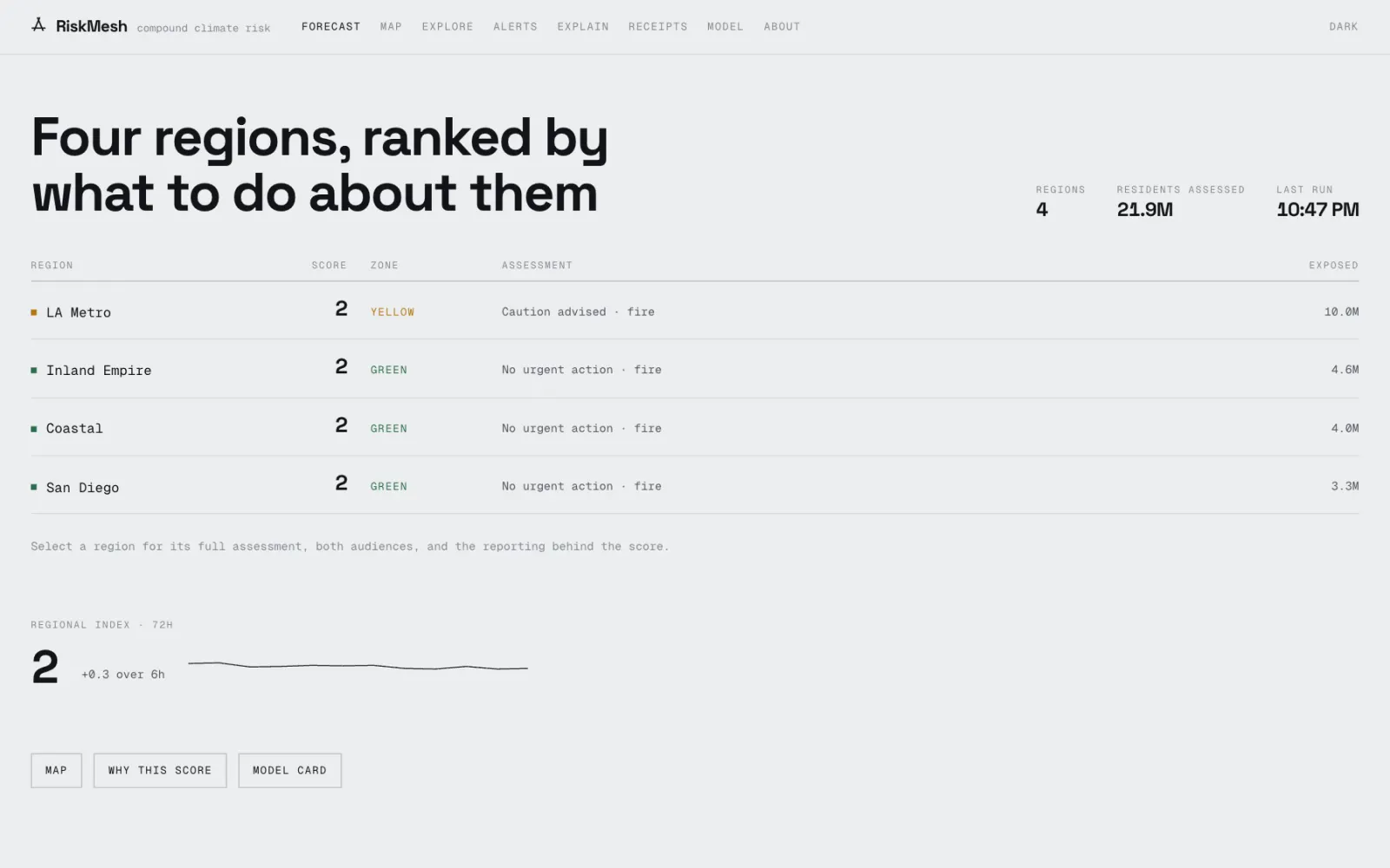
I set one rule for the whole site: a number appears only if the system actually computed it from data. That sounds obvious, but an earlier version of my code broke it in four places. When a model or data feed failed, the site showed made-up values instead of an error: a forecast drawn from a sine wave, invented temperatures, and a hard-coded chart explaining the score. I removed all four and wrote automated tests that fail if anything like them comes back. Now, if the grid feed is down, the grid score is simply missing and the page says why.
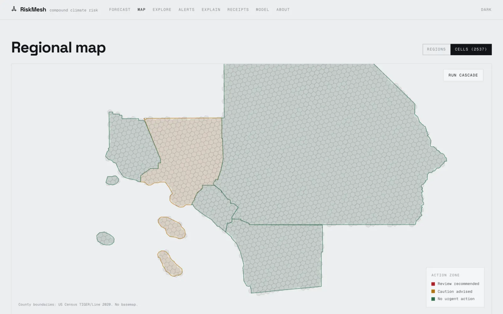
I also redrew the map. My first regions were hand-drawn rectangles, and they were wrong: one "coastal" box held 3.6 million Los Angeles residents and nobody from the counties it was supposed to cover, and 4.1 million people fell outside every box. I replaced them with official county boundaries and rebuilt the population counts tract by tract.
What happened
RiskMesh is live and updates itself on a schedule. To check whether the combined score means anything, I replayed three real events through the models: the August 2020 heat wave (when California had rolling blackouts and major fires), the December 2017 Thomas Fire during Santa Ana winds, and the September 2022 heat wave that pushed the grid into an emergency. A useful compound score should put days like those near the top of its range, so that is the test I ran them against.
The site is a prototype with no users I can point to, and I wrote down its limits on the site itself. The combined score ranks regions, but it is not a true probability. It counts everyone in a region, not only the people inside a fire's path. The infrastructure data in the "run cascade" demo on the map is synthetic, so I kept it out of the real scores. The grid model was also trained on demand levels lower than some regions now reach, so those regions carry a visible "outside training range" flag instead of a confident-looking number.
Under the hood
Models
Three gradient-boosted tree models (XGBoost), one per hazard, with hyperparameters tuned by Optuna. Fire uses daily maximum temperature, peak wind, minimum humidity, rainfall over 1 and 30 days, days since rain, drought level and a Santa Ana indicator. Grid stress uses temperature and electricity load, including load 24 hours and 7 days earlier and a 7-day average. Drought uses the US Drought Monitor level, rainfall windows, a 90-day rainfall deficit and temperature. All three were cross-validated with time-ordered splits, so each test fold comes after its training data. The latest committed run shows an area under the receiver operating characteristic curve (AUC, where 1.0 is perfect ranking) of 0.955 for fire and 0.996 for grid stress, from a single snapshot dated Mar 25, 2026.
The compound index blends the three outputs with fixed weights. If one component has no live input, the blend is rescaled over the ones that do and the page names which ones it used, instead of treating the missing one as zero. The index is cut into four likelihood bands at 25, 50 and 75; population sets the consequence band. All twelve coefficients and cutoffs live in one published parameters file.
Uncertainty and explanations
Each score comes with a range from conformal prediction. In plain terms, I set aside past cases, measured how far the model's guesses missed the real outcome, and use the size of those misses to put a band around each new prediction. The fire model uses a cross-conformal classifier (MAPIE) at 90% confidence, so the range is honest about how wrong the model has been before.
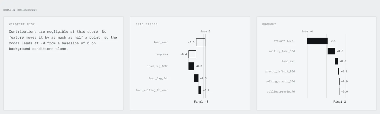
Explanations use SHAP (SHapley Additive exPlanations), a method from game theory that splits one prediction into how much each input pushed it up or down. On the site this appears as bars: a solid bar raised the score, a hollow bar lowered it.
Validation
The compound model is checked against known Southern California events (Aug 14 to 16, 2020; Dec 5 and 10, 2017; Sep 6 and 7, 2022) by testing whether those dates land in the top 10% of compound scores. Historical analogs are found with vector search (pgvector), which matches today's conditions to the most similar past days.
Data and stack
Live feeds from NASA, the National Oceanic and Atmospheric Administration (NOAA), the U.S. Geological Survey (USGS) and the Energy Information Administration (EIA), plus 2020 Census population. Geography uses official 2020 TIGER/Line county boundaries and Uber's H3 hexagon grid at resolution 6: 5,023 tracts, 2,537 cells and 21,943,314 residents, checked so that no cell belongs to two regions. The backend is Python, FastAPI and PostgreSQL with Alembic migrations; the frontend is Next.js and TypeScript.