Lead project
Who lived inside the 2025 Los Angeles fires?
After the Palisades and Eaton fires, I wanted to know which neighborhoods actually sat inside the burned areas and how much those households earned. I built a public dataset and map that answers that for every census block group in Los Angeles County, published it on Harvard Dataverse with a permanent DOI (digital object identifier), and now run a second version that records flood and mudslide warnings over the burn scars through this winter.
- Role
- Sole author
- When
- Aug 2026 (dataset); version 2 collecting since Sep 3, 2026
- Mentor
- Dr. Bo Zhao, Humanistic Geographic Information Systems (GIS) Lab, University of Washington
- Live map
- wildfire.myrondomain.com
- Dataset
- doi.org/10.7910/DVN/2R57BG (Harvard Dataverse, public domain)
The problem
News coverage of the January 2025 fires talked about whole cities: Pacific Palisades, Altadena, Malibu. But a fire perimeter cuts through cities unevenly. One street burns and the next one over does not, and the people on those two streets can have very different incomes, insurance and ability to rebuild.
The Census Bureau publishes income data for small areas called block groups. A block group is a few city blocks, usually 600 to 3,000 people. That is about the smallest unit where public income numbers exist, so it is the right size for asking who was inside a fire line.
Who it's for
People who decide where recovery money and outreach go: city and county staff, nonprofits, reporters, and researchers who want a clean starting table instead of building one from scratch. The map is meant for someone who has never used mapping software.
What I built
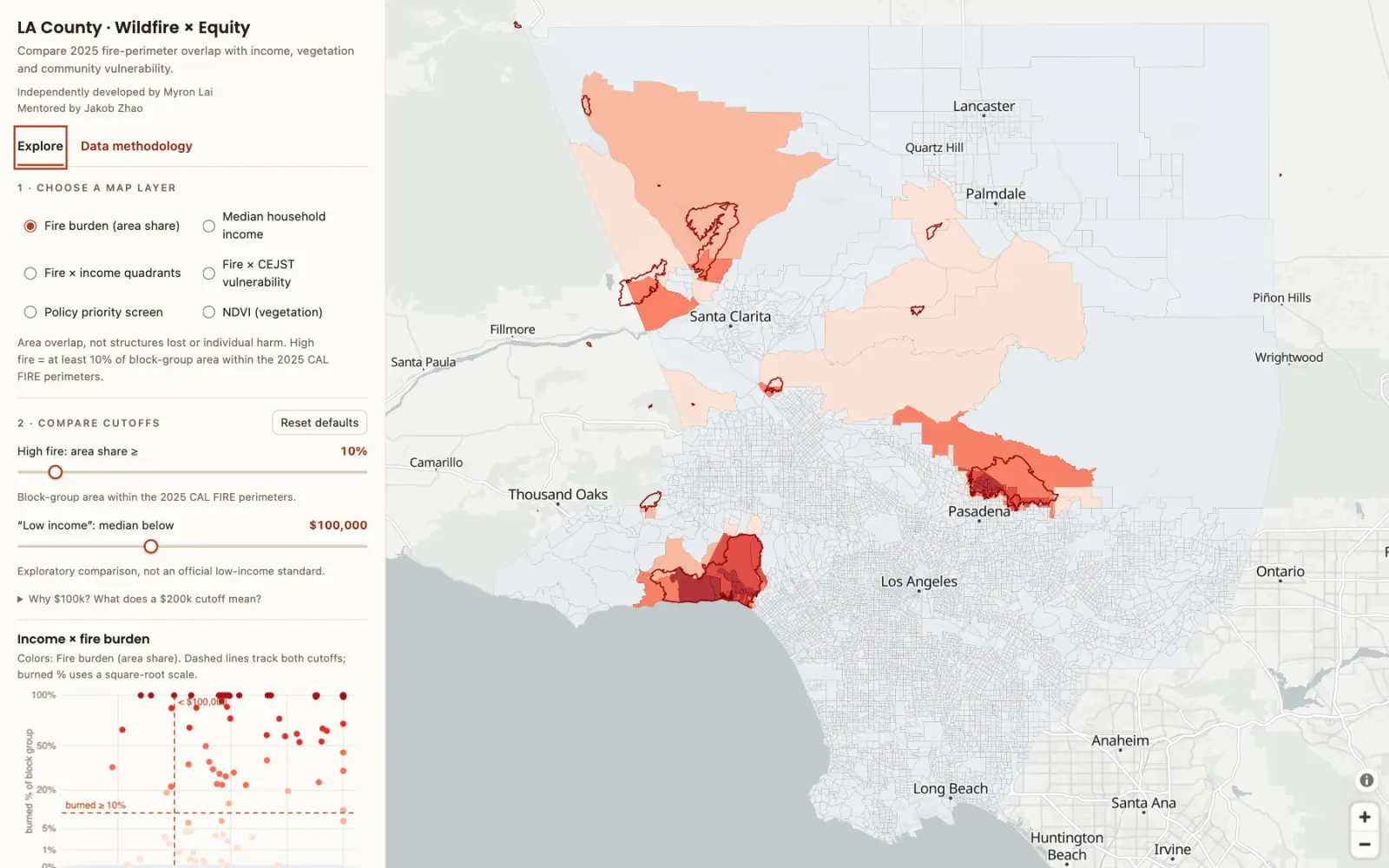
I overlaid the 19 official 2025 fire perimeters from CAL FIRE (the California Department of Forestry and Fire Protection) on all 6,587 block groups and measured what share of each block group's land was inside a perimeter. I joined that to median household income from the American Community Survey (ACS), a vegetation index from satellite images, and the federal list of disadvantaged communities.
On the map, two sliders let you choose what counts as "high fire" and "low income". The map, a scatter plot and a ranked table all re-sort as you drag. I built it that way because any single cutoff is a judgment call, and I wanted readers to see how the answer changes when they move it.
Dr. Bo Zhao, who runs the Humanistic GIS Lab at the University of Washington, mentored the project. The framing of the map follows his earlier equity mapping work, and I simplified the interface after his feedback. He is credited on the map itself.
What happened
With the default cutoffs (10% of area burned, and income under $100,000, close to the county's block-group median of $93,240), 62 block groups count as high fire. Most of them are not poor. Nine of them sit at the Census income cap ($250,000 or more). The 9 highest-priority block groups, which have high fire plus several vulnerability flags, are almost all in Altadena, inside the Eaton fire.
I published the full table, the fire perimeters and the scripts on Harvard Dataverse in August 2026 under a public-domain license, so anyone can reuse them without asking.
Version 2: warnings over the burn scars
Burned hillsides can't hold rain, so after a fire the next danger is flooding and debris flows (fast mudslides full of rock and ash). The National Weather Service (NWS) issues these warnings for whole watersheds, the area of land that drains into one creek or channel. Watersheds follow the shape of the mountains, while neighborhoods follow streets and city lines. A single warning can cover parts of several neighborhoods and miss half of another, so it is hard to say from the warning alone who was actually told to leave.
Forecasters expected a wet El Niño winter for 2026 to 2027, so I started a collector on September 3, 2026. Every 30 minutes it saves any NWS flood or debris-flow alert that touches a 2025 burn scar and records which block groups, and which incomes, fall inside the warning area. It also logs rain forecasts against measured rain, drought conditions and El Niño indices. By early October it had captured 4 alerts, all minor flood advisories. The season has barely started, so there are no findings yet, and the data can only describe who was inside a warning area, not who received it or acted on it.
Under the hood
Dataset (version 1)
- Inputs: 2024 Census cartographic block groups; CAL FIRE historic perimeters filtered to 2025 (19 fires); ACS 2024 5-year median household income (table B19013) and population; NASA MODIS (Moderate Resolution Imaging Spectroradiometer) MOD13Q1 NDVI (Normalized Difference Vegetation Index); CEJST 2.0 (Climate and Economic Justice Screening Tool) disadvantaged status. VIIRS (Visible Infrared Imaging Radiometer Suite) fire detections from NASA FIRMS (Fire Information for Resource Management System) appear only as a secondary popup.
- Overlap areas are computed in EPSG:3310, California Albers, an equal-area projection. Ordinary web-map projections stretch area as you move north, which would bias a "share burned" number; equal-area keeps a square kilometer the same size everywhere in the county.
- Default thresholds: high fire at 10% of area; income cutoff $100,000; NDVI 0.258 (data median); population density 6,745 per km² (75th percentile).
- Policy screen at defaults: 9 highest priority, 49 elevated, 1,308 with insufficient covariate data. 88 block groups have any overlap at all.
- Limits I state on the map: area overlap is not structures lost or individual harm; the cutoffs are exploratory, not official standards; findings are ecological, not causal.
- Front end: static HTML and JavaScript with MapLibre GL and an OpenFreeMap basemap, a canvas scatter plot, served from a small nginx container with compressed GeoJSON. Analysis in Python with GeoPandas.
Collector (version 2)
- Polls the NWS active-alerts API every 30 minutes. Each qualifying alert polygon is spatially joined to the 2025 perimeters and ACS block groups in EPSG:3310, keeping the precise alert polygon separate from the coarser forecast-zone outline.
- Daily side series: the National Oceanic and Atmospheric Administration (NOAA) Climate Prediction Center's Oceanic Niño Index (ONI) and Relative Oceanic Niño Index (RONI), NWS gridpoint precipitation forecasts against five airport stations, the US Drought Monitor for Los Angeles County, and CAL FIRE incidents.
- Append-only storage with raw JSON archives, a poll log and error logs, so every row traces back to the original message. Gaps in polling are recorded rather than filled. 15 test files cover the pipeline.
- Runs on a GitHub Actions schedule plus a backup worker; a bot commits each run.